Improve savings rate and work towards a fully funded retirement
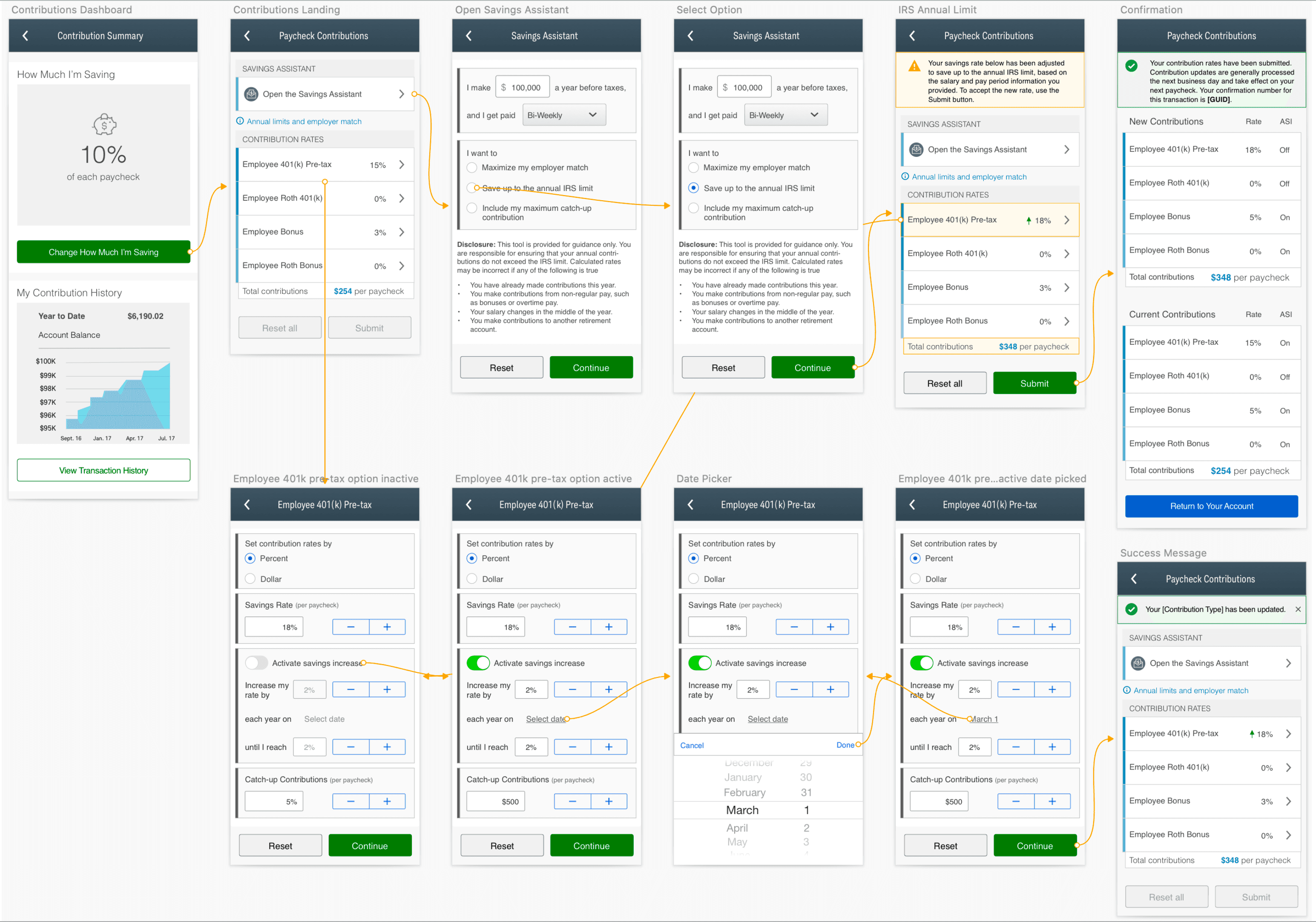
Paycheck Contributions
E2E
Information Architecture
UX/UI
Project Overview
The Paycheck Contributions flow is a crucial tool in retirement planning, designed to:
Guide participants in optimizing their savings strategy
Educate participants on the impact of contribution decisions
Facilitate easy adjustments to savings rates
Visualize the long-term effects of current savings choices
The redesign leveraged user-centered design and advanced visualization techniques to demystify complex financial concepts, making it easier for participants to take control of their retirement savings.
Problem
The 'Paycheck Contributions' platform's outdated, confusing interface:
Frustrates users
Obscures key insights
Impedes informed retirement planning
Hypothesis
Redesigning the "Paycheck Contributions" platform will:
Increase user engagement
Encourage higher savings rates
Help users align contributions with retirement goals
Improve overall retirement planning and outcomes
Goal
Over the next 6 months:
Increase average user session duration by 20%
Boost average contribution amount by 10%
Maintain or improve user satisfaction rating
My Role
As the founding designer on the team, I led the comprehensive redesign of the Paycheck Contributions flow:
Identified user pain points
Planned features aligned with user needs and business goals
Bridged product and engineering teams
Ensured smooth implementation of design with engineering
Team: 1 Product Manager, 6-8 Engineers, Key stakeholders (C-suite execs)
Design Process
Research
Analyzed user needs and identified improvement opportunities
Ideation & Design
Developed concepts and wireframes via brainstorming sessions and design sprints
Usability Testing
Conducted tests with target users to validate design decisions
Iterative Refinement
Continuously improved design based on feedback
Developer Collaboration
Ensured accurate implementation via regular check-ins and design/dev reviews
Research Insights
User research helped reveal three primary user needs:
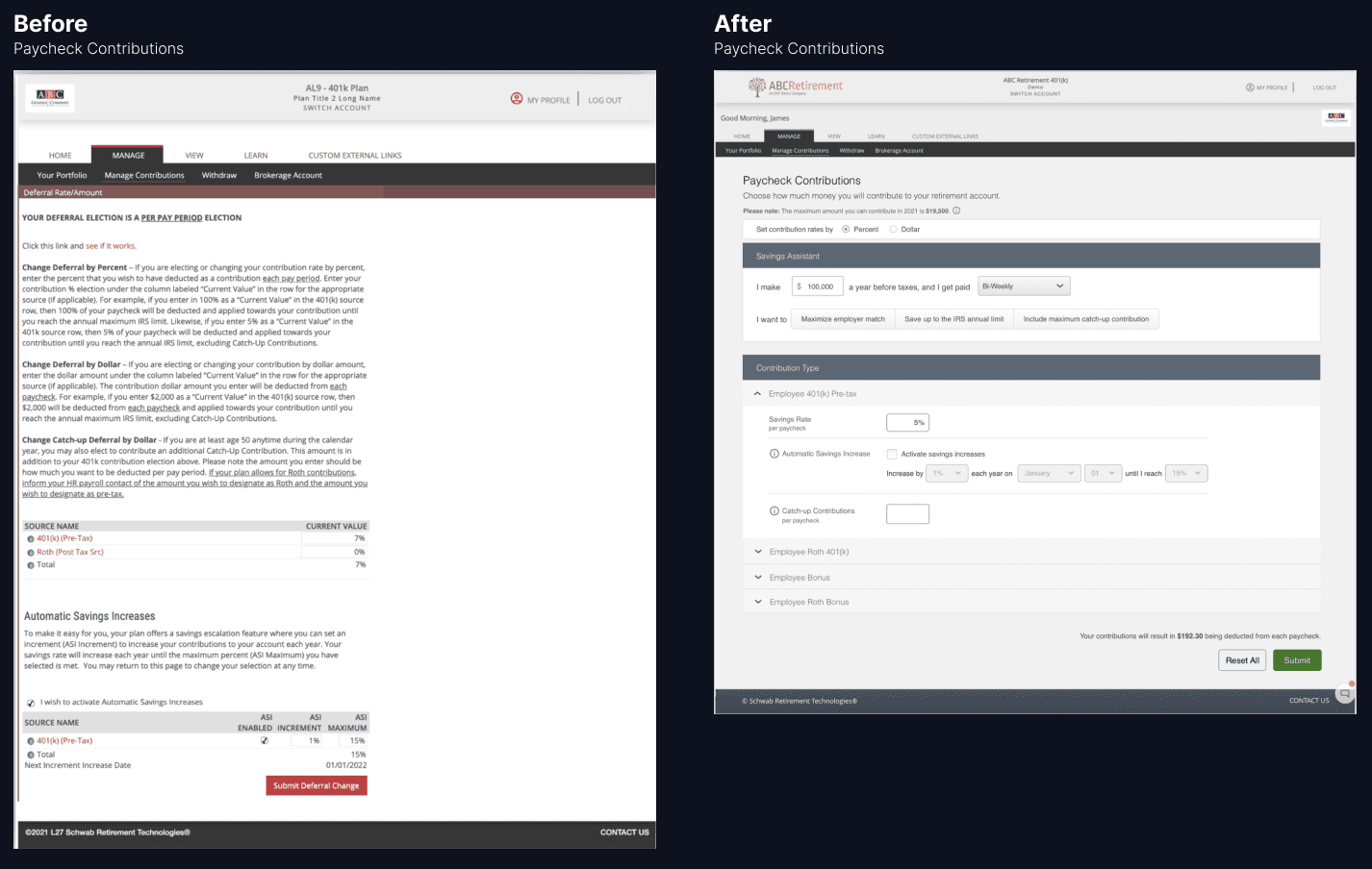
1. Clear Contribution Visualization
Participants want to easily understand their contributions through:
Visual allocation breakdowns
Clear explanations of financial impact
Intuitive charts and graphs
2. Education on Paycheck Contributions
Participants seek guidance via:
Integrated educational tools
Plain-language explanations of contribution types
Actionable tips for informed decision-making
3. Financial Data Security
Users prioritize the safety of their information through:
Strong, visible security measures
Transparent data protection policies
Regular security update communications
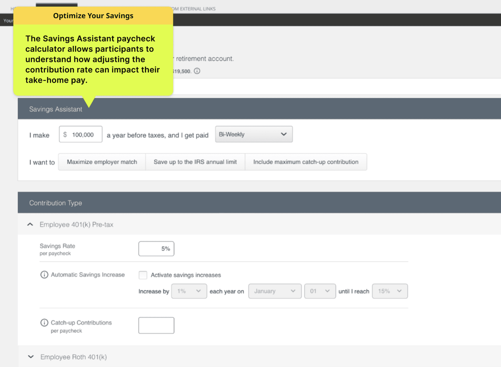
Optimize Your Savings
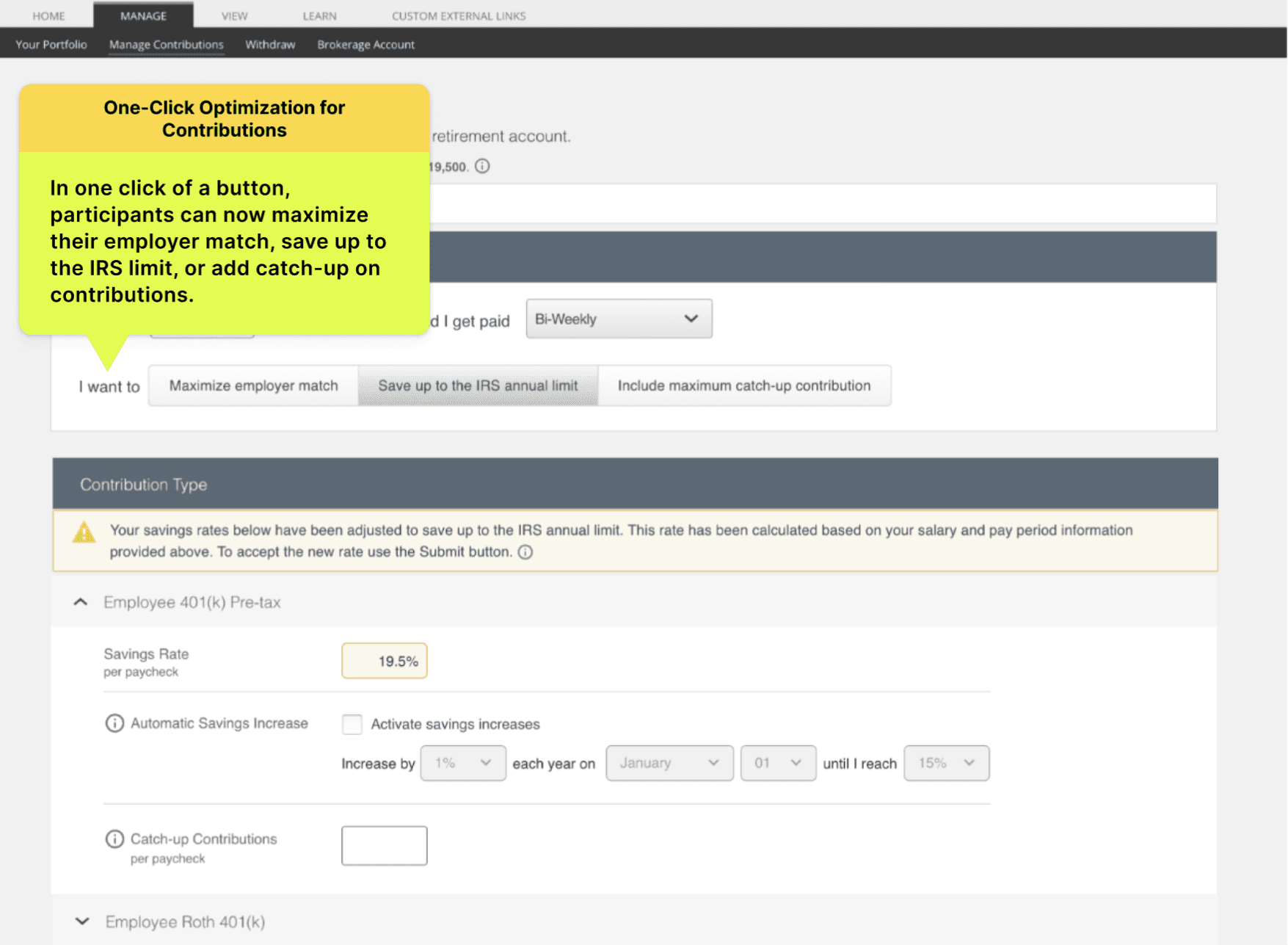
One-Click Optimization for Contributions
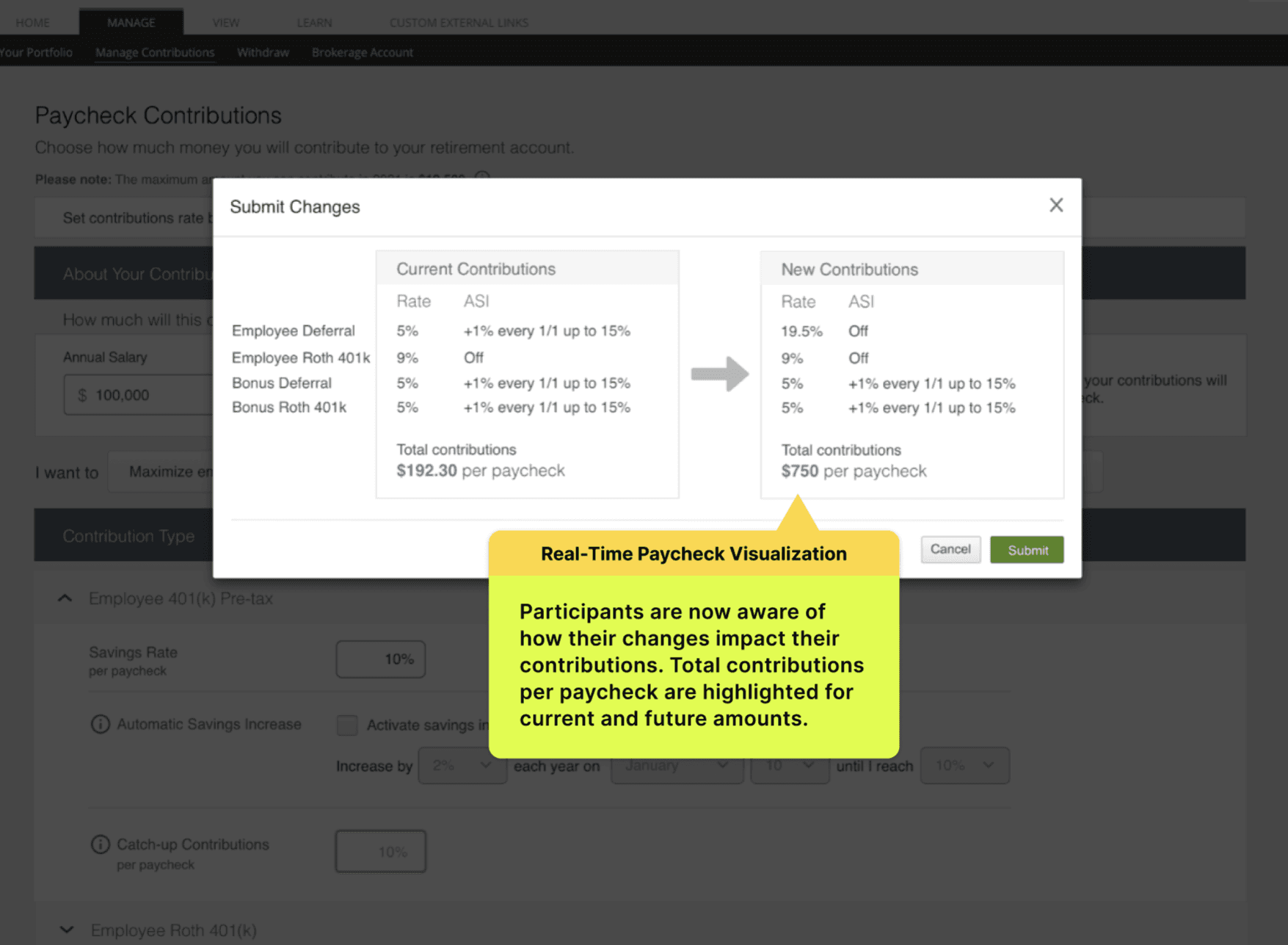
Real-Time Paycheck Visualization
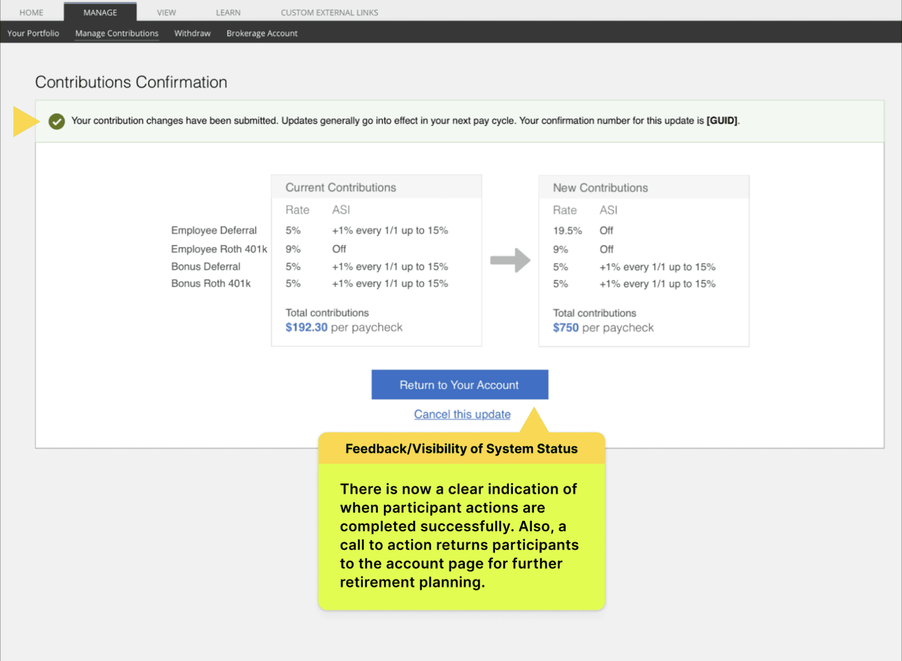
Feedback & Visibility of System Status
Mobile Design
Usability Testing Insights
Usability testing revealed valuable insights across several key areas:
User Interface & Navigation
✅ Clean layout improved overall navigation
❗ Some users struggled to locate contribution adjustment features
❗ Contribution options descriptions were often too complex
Content & Education
✅ "Savings Assistant" calculator was well-received
✅ Users reported better understanding of investment choices
✅ Increased confidence in making contribution decisions
Multi-Platform Accessibility
✅ Mobile app introduction significantly boosted engagement
✅ Consistent user experience across desktop and mobile
User Confidence & Feedback
✅ New feedback and confirmation features increased retirement readiness confidence
✅ Decreased anxiety levels related to retirement planning
Security
✅ Users generally felt secure
❗ Desire for enhanced security features, especially two-factor authentication (2FA)
Key Improvement Areas
Future considerations include:
Streamline contribution adjustment UI to reduce task completion time
Simplify financial jargon to increase user comprehension
Implement additional security features, particularly 2FA
These improvements will focus on making the platform more intuitive, accessible, and secure, further enhancing user experience and confidence in retirement planning.
Results & Impact
The redesigned platform delivered measurable improvements across key metrics:
User Engagement:
Monthly active users increased by 35%
Support Efficiency:
Navigation and functionality-related support tickets decreased by 40%
User Satisfaction:
Feedback was overwhelmingly positive
Retirement Savings:
Average contribution rates increased from 6% to 7.2% of income
Task Completion:
Task flow drop-off rates reduced by 60%
The redesign provided a more intuitive, user-friendly experience that simplified key tasks and addressed previous pain points. This led to increased engagement, higher contribution rates, and improved user satisfaction.