Investment Elections

Tailor your investments and retire with confidence

Data Visualization

Information Architecture

UX/UI

Client

Schwab Retirement

Role

Founding Product Designer

Date

March 2021

Duration

~3 months

Client

Schwab Retirement

Role

Founding Product Designer

Date

March 2021

Duration

~3 months

Client

Schwab Retirement

Role

Founding Product Designer

Date

March 2021

Duration

~3 months

Project Overview

As the founding designer, I reimagined our platform's Investment Elections flow to empower participants to tailor investments and retire confidently.


Key Objectives:
  1. Facilitate personalized strategies

  2. Enhance option understanding

  3. Boost retirement planning confidence

  4. Provide clear allocation visualization


Leveraging user-centered design and advanced data visualization, I transformed complex financial decisions into intuitive, actionable steps. This redesign aimed to demystify the investment process, enabling users to control their financial future with confidence.


Problem


The current 'Investment Elections' platform faces several challenges:

  • Outdated and unengaging user interface

  • Navigation difficulties

  • Unclear fund details and allocations


Participants struggle to efficiently understand, visualize, and manage their investment allocations.


Hypothesis


By redesigning the 'Investment Elections' platform with:

  1. A modern, user-friendly interface

  2. Enhanced fund details

  3. Dynamic data visualization tools


We expect to achieve:

  • Increased user engagement

  • Improved user satisfaction

  • More informed decision-making by participants


Project Goals


Over the next 6 months:

  1. Increase active quarterly investment adjustments by 25%

  2. Boost investment portfolio diversification by 15%

  3. Maintain or improve current user satisfaction levels


My Role


As the sole designer on the team, I led the entire redesign process from research to implementation:

  • Translated research into user flows and high-fidelity prototypes

  • Iteratively refined designs based on user feedback

  • Aligned solutions with business goals alongside Product Manager

  • Ensured accurate implementation through developer collaboration

  • Presented to stakeholders, advocating for user-centered principles


Throughout, I balanced user needs, business objectives, and technical constraints to deliver a cohesive design solution.
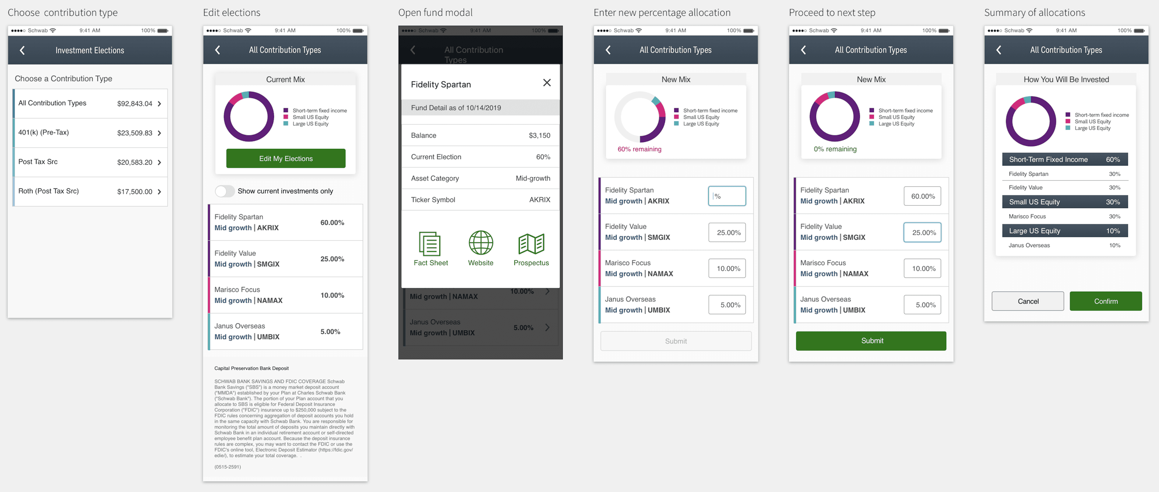
Efficient Filtering

Before: Participants had to sift through all their investments, including inactive ones, to see their portfolio. ‍ ‍After: A toggle feature allows participants to view only their current investments, decluttering their view and aiding faster decision-making.

Before: Participants had to sift through all their investments, including inactive ones, to see their portfolio. ‍ ‍After: A toggle feature allows participants to view only their current investments, decluttering their view and aiding faster decision-making.

Before: Participants had to sift through all their investments, including inactive ones, to see their portfolio. ‍ ‍After: A toggle feature allows participants to view only their current investments, decluttering their view and aiding faster decision-making.

Simplified Navigation

Before: The navigation was complicated; users had to backtrack to a previous screen to change their contribution type.‍ After: Users can seamlessly toggle between different contribution types on the same screen, enhancing ease of use.

Before: The navigation was complicated; users had to backtrack to a previous screen to change their contribution type.‍ After: Users can seamlessly toggle between different contribution types on the same screen, enhancing ease of use.

Before: The navigation was complicated; users had to backtrack to a previous screen to change their contribution type.‍ After: Users can seamlessly toggle between different contribution types on the same screen, enhancing ease of use.

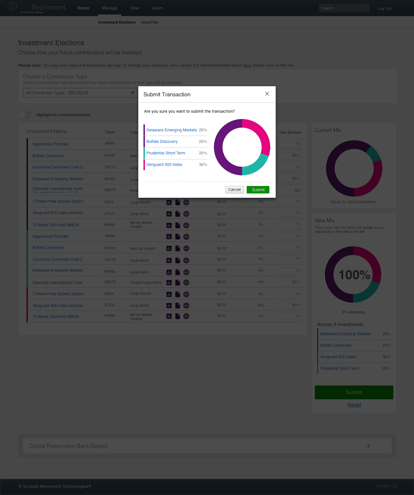
Enhanced Data Visualization

Before: The platform did not have visual aids to help participants understand their investment allocations. ‍After: Animated charts, especially the donut chart, offer a clear visual representation of how funds are allocated. This kind of data visualization simplifies complex financial data, making it more accessible and understandable.

Before: The platform did not have visual aids to help participants understand their investment allocations. ‍After: Animated charts, especially the donut chart, offer a clear visual representation of how funds are allocated. This kind of data visualization simplifies complex financial data, making it more accessible and understandable.

Before: The platform did not have visual aids to help participants understand their investment allocations. ‍After: Animated charts, especially the donut chart, offer a clear visual representation of how funds are allocated. This kind of data visualization simplifies complex financial data, making it more accessible and understandable.

Transaction Review and Confirmation

Before: Users submitted allocations directly, risking unintended choices and errors without a confirmation step. Accidental submissions led to user frustration and required support to undo transactions. ‍After: The new confirmation modal summarizes investment allocations before finalizing, preventing mistakes. It confirms intended choices, increasing user confidence and satisfaction.

Before: Users submitted allocations directly, risking unintended choices and errors without a confirmation step. Accidental submissions led to user frustration and required support to undo transactions. ‍After: The new confirmation modal summarizes investment allocations before finalizing, preventing mistakes. It confirms intended choices, increasing user confidence and satisfaction.

Before: Users submitted allocations directly, risking unintended choices and errors without a confirmation step. Accidental submissions led to user frustration and required support to undo transactions. ‍After: The new confirmation modal summarizes investment allocations before finalizing, preventing mistakes. It confirms intended choices, increasing user confidence and satisfaction.

Prototype

Prototype

Prototype

Mobile Design


Results & Impact

The platform enhancements yielded significant performance gains:

  1. Increased User Engagement:

    +35% in active sessions


  2. Streamlined Navigation:

    -50% in redundant page navigations


  3. Improved User Satisfaction:

    +40% in survey scores


  4. Decreased User Errors:

    -30%, showcasing the UI's increased clarity and ease of use


  5. Enhanced Utility:

    Users reported greater utility from interactive elements like the donut chart

Challenges

Challenges

Challenges

Key challenges I faced included navigating technical constraints from platform limitations and performance considerations. I also had to ensure a consistent, responsive experience across devices while maintaining alignment with the original design vision through continuous feedback loops. Close collaboration with developers allowed me to find compromises that balanced user experience with technical feasibility.

Key challenges I faced included navigating technical constraints from platform limitations and performance considerations. I also had to ensure a consistent, responsive experience across devices while maintaining alignment with the original design vision through continuous feedback loops. Close collaboration with developers allowed me to find compromises that balanced user experience with technical feasibility.

Key challenges I faced included navigating technical constraints from platform limitations and performance considerations. I also had to ensure a consistent, responsive experience across devices while maintaining alignment with the original design vision through continuous feedback loops. Close collaboration with developers allowed me to find compromises that balanced user experience with technical feasibility.

Next steps...

Next steps...

Next steps...

Post-launch, the plan is to continuously monitor user feedback and platform analytics for future improvements.

Post-launch, the plan is to continuously monitor user feedback and platform analytics for future improvements.

Post-launch, the plan is to continuously monitor user feedback and platform analytics for future improvements.

© 2025 Jyoti Bankapur. All rights reserved.

© 2025 Jyoti Bankapur. All rights reserved.

© 2025 Jyoti Bankapur. All rights reserved.